sys·tem·at·ic /ˌsɪstəˈmætɪk/, adjective: following a system, proceeding by a defined order; methodical and consistent.
SYSTEMATIC
One word — systematic — turned into colour, composition, type and space.
This semester project documents the work produced in the course Communication & Composition. Its focus is the development of clear, comprehensible and effective visual communication of design ideas: from colour theory and composition through typography and layout to digital image editing and vector graphics, with particular emphasis on combining analogue and digital techniques.
At the centre stands the adjective SYSTEMATIC — defined by clarity, order and structure. Blue forms the foundation of the work and acts as the dominant hue, standing for technology, construction and a precise, rational eye. Restrained shares of yellow, green and orange set deliberate accents and extend the strict system with subtle emotional nuance. The result is a field of tension between clear structure and atmosphere.
00
Concept
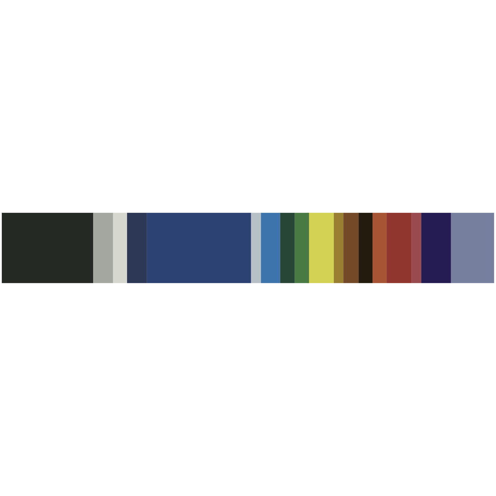
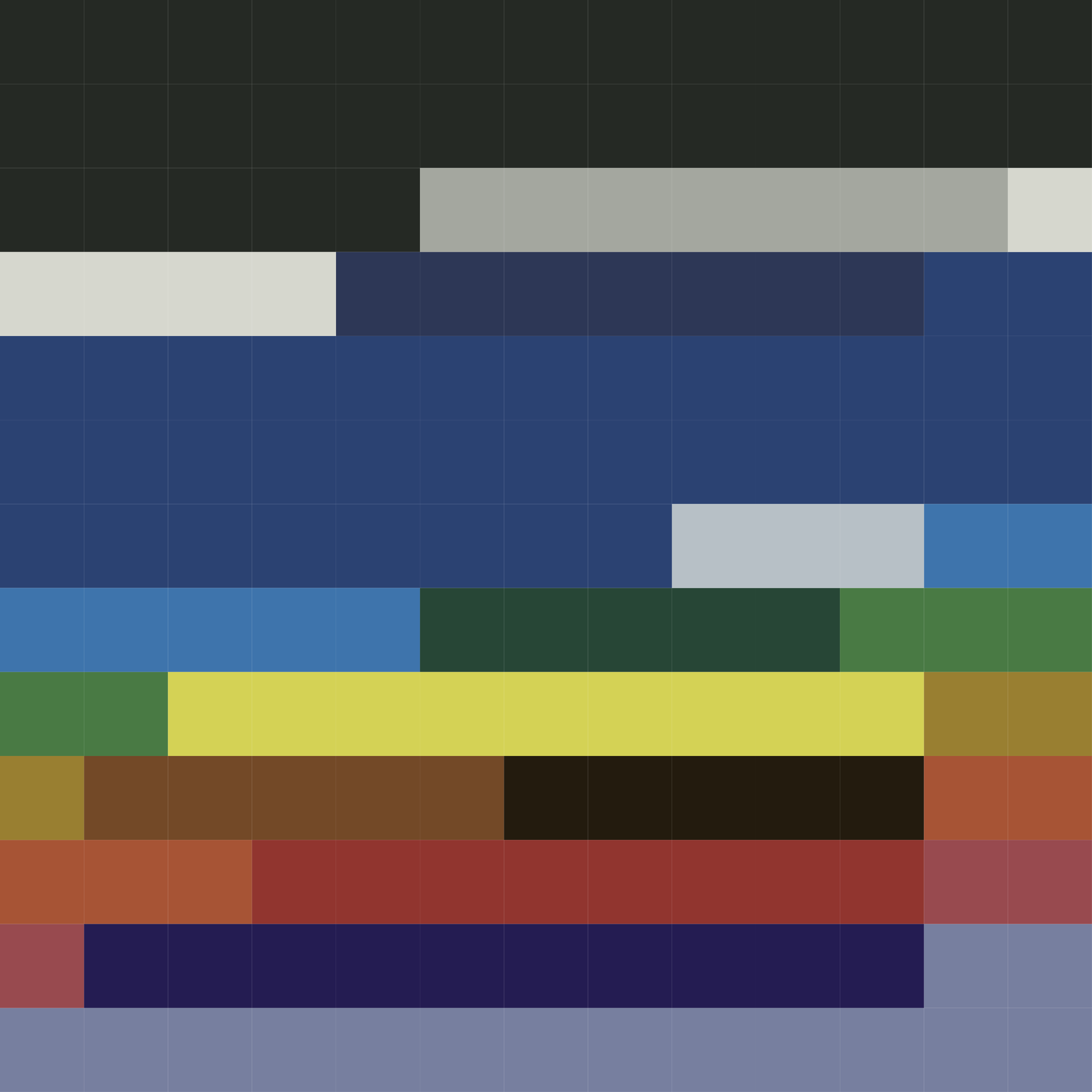
#252924
#a4a79f
#d6d7ce
#2d3756
#2b4272
#b7c0c6
#3e74ac
#274636
#497a44
#d4d255
#997f31
#734927
#231b0e
#a75435
#91352f
#984a4f
#241c52
#777f9f
01
Colour
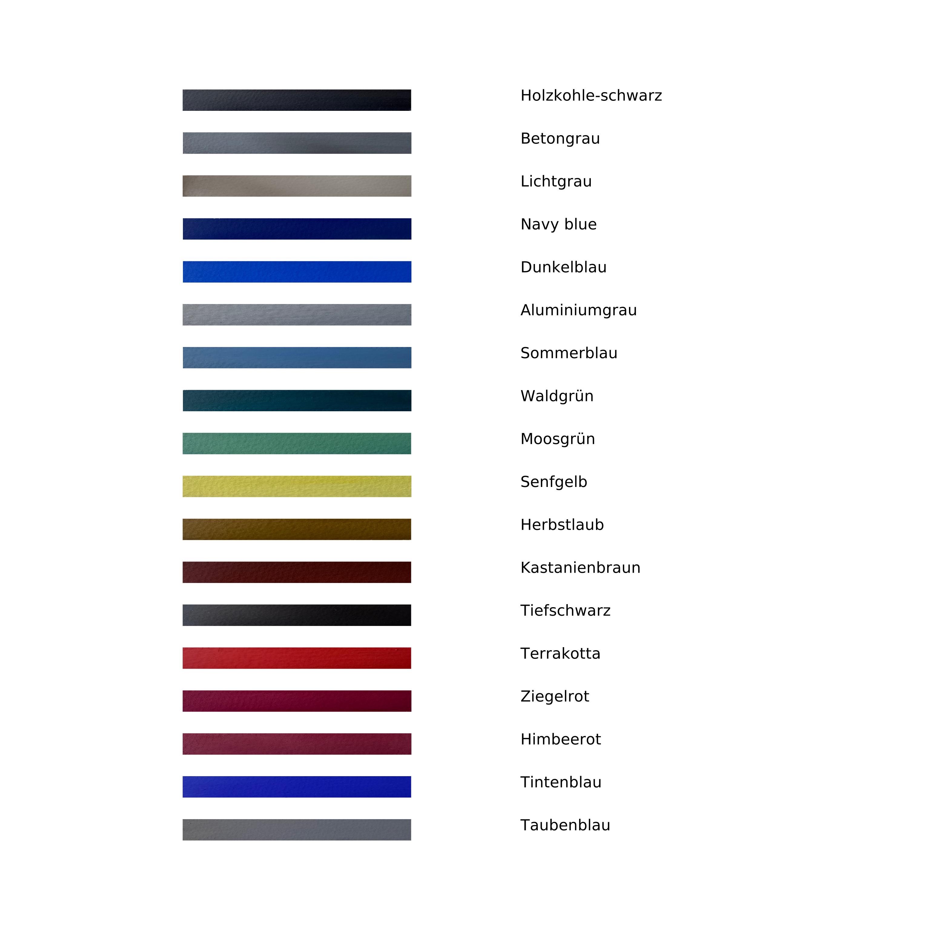
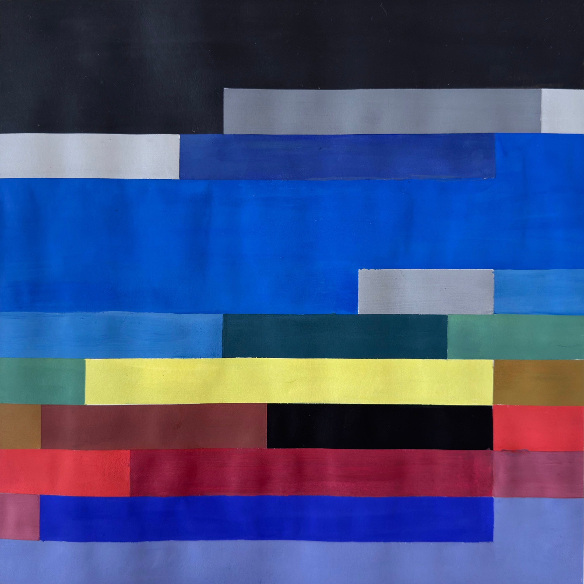
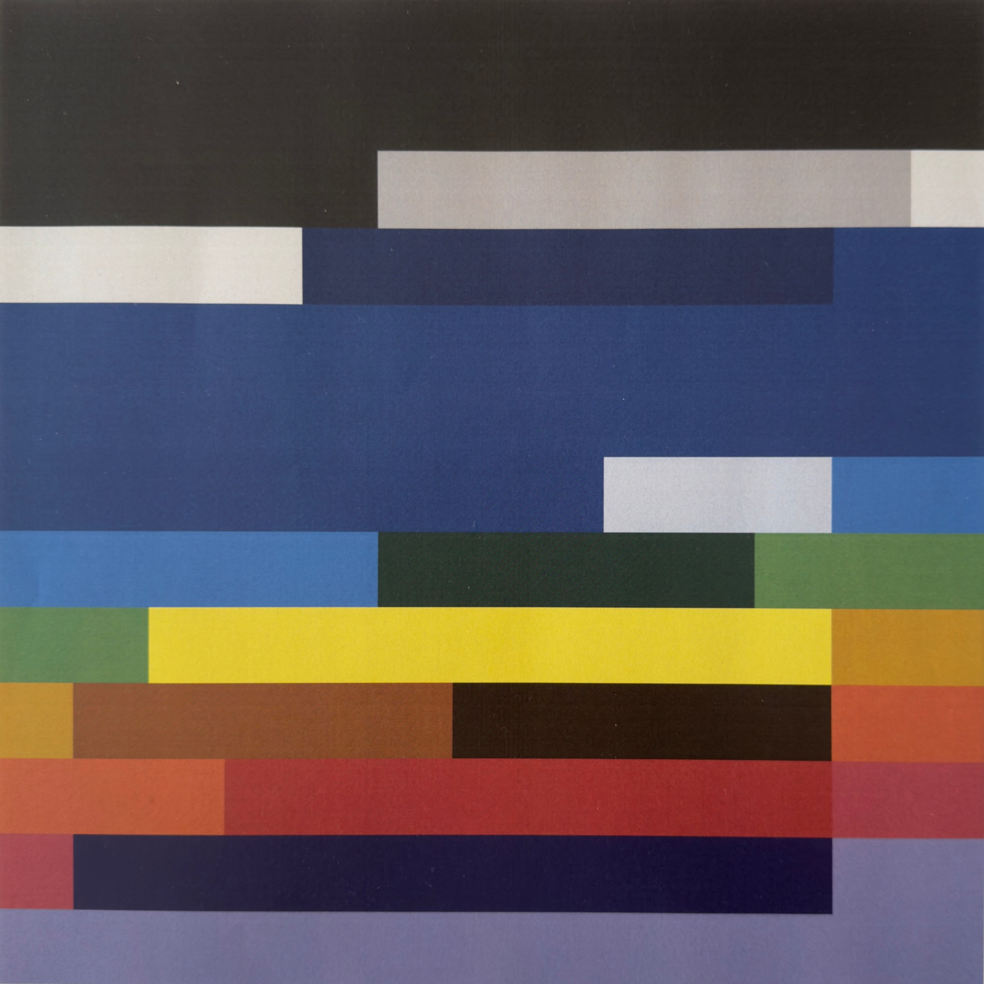
This task examines colour as a design tool, based on the adjective colour chord "systematic". Through analogue mixing, precise naming and a digital translation into a mosaic, colour effect, proportion and composition are used deliberately to translate a single word into visual form.
02
Composition
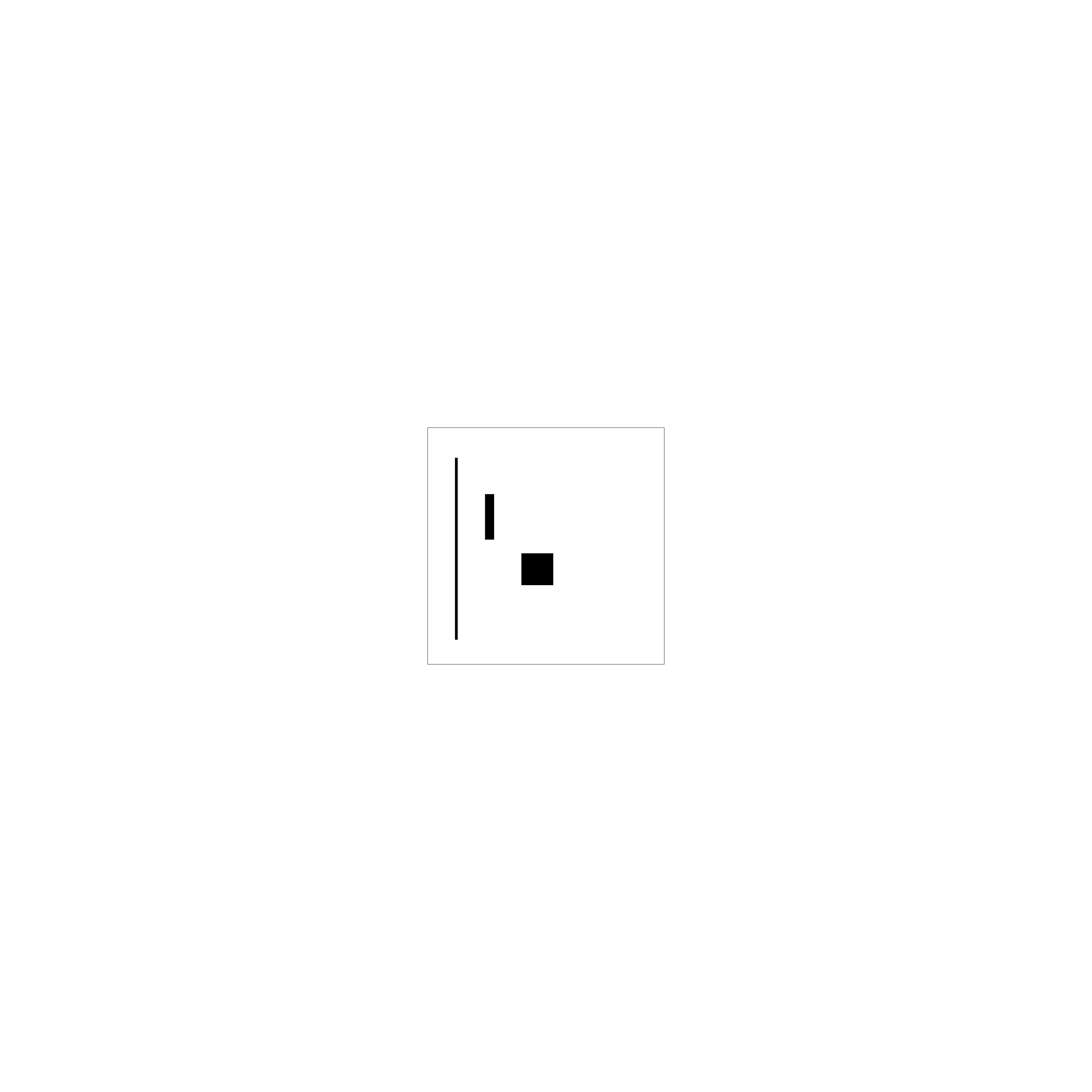
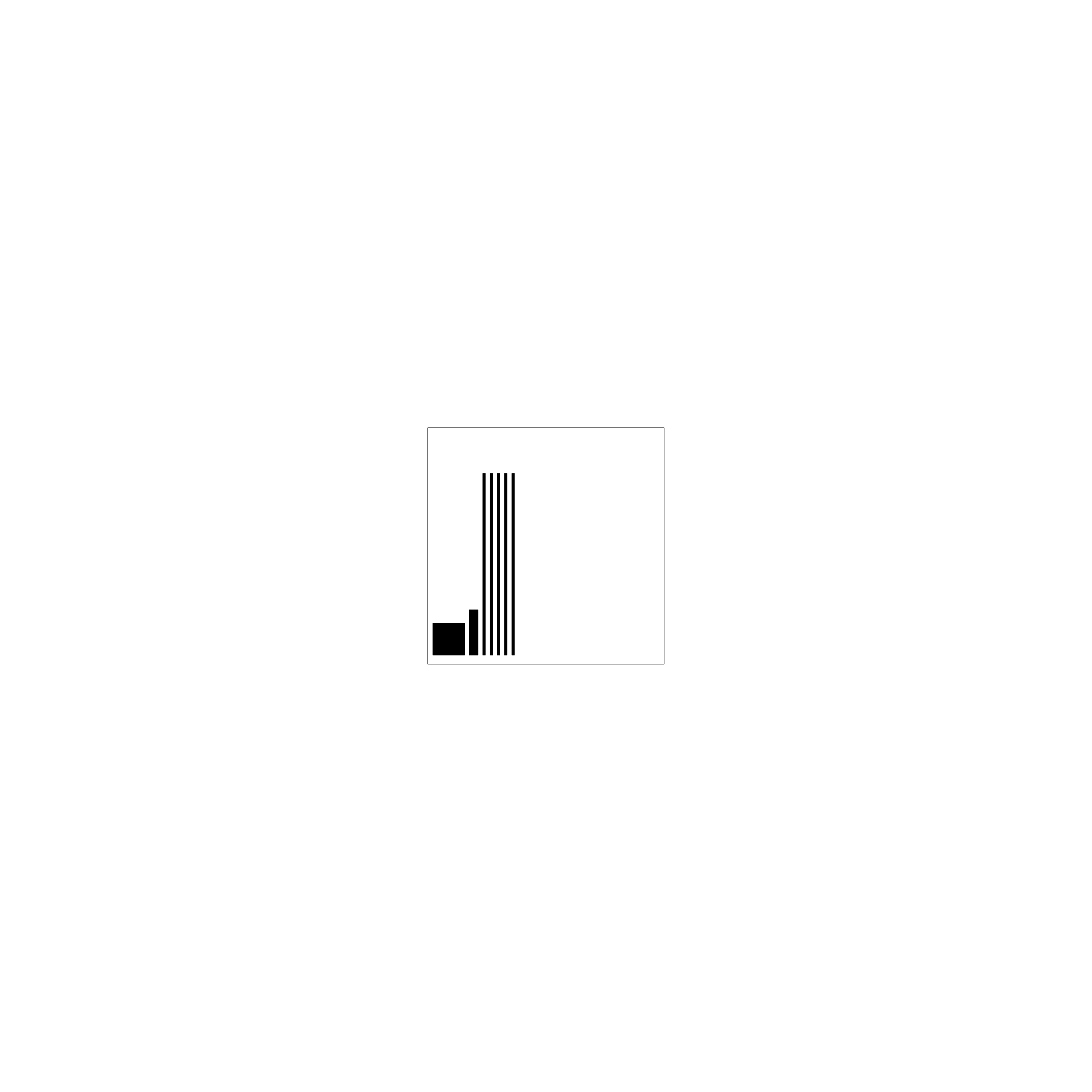
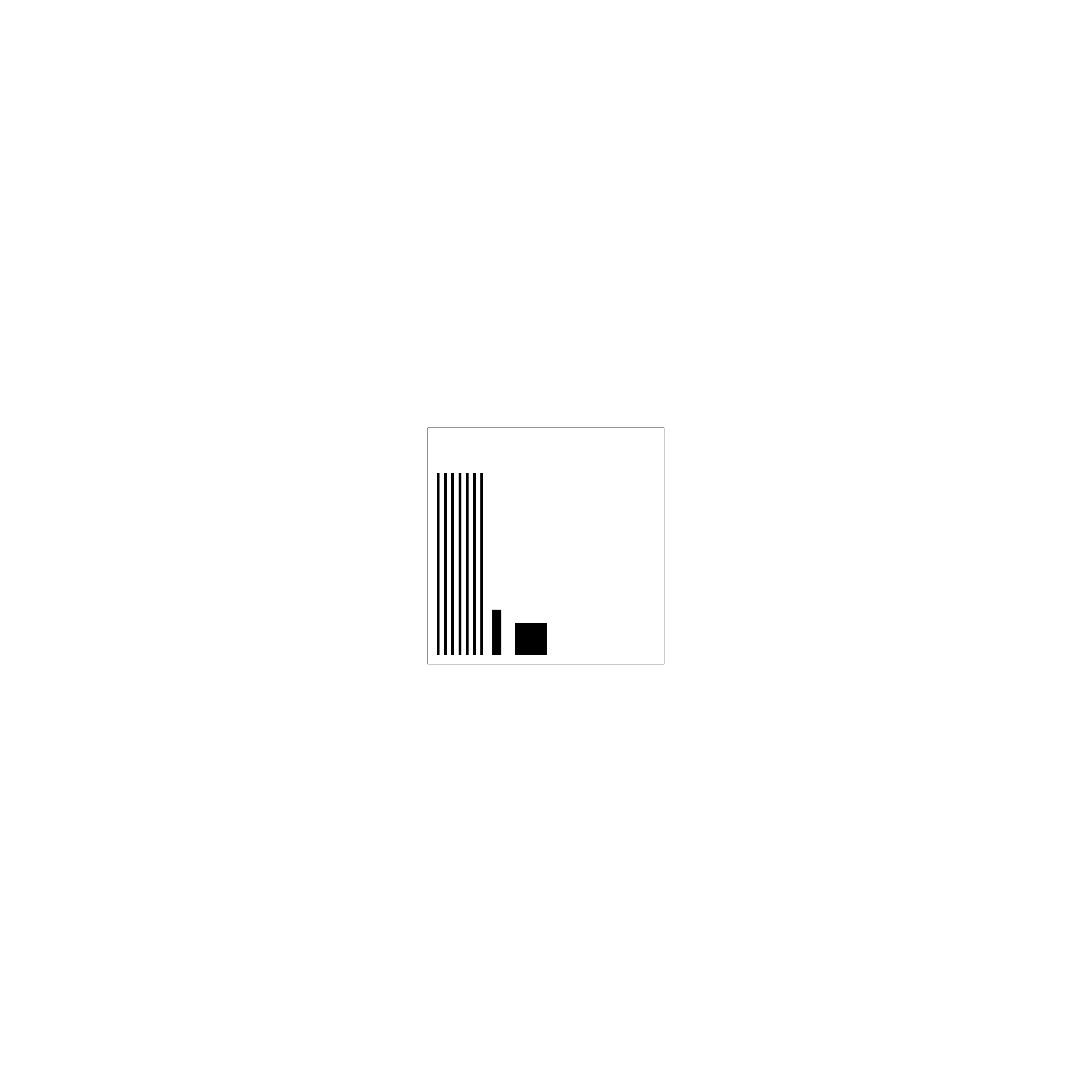
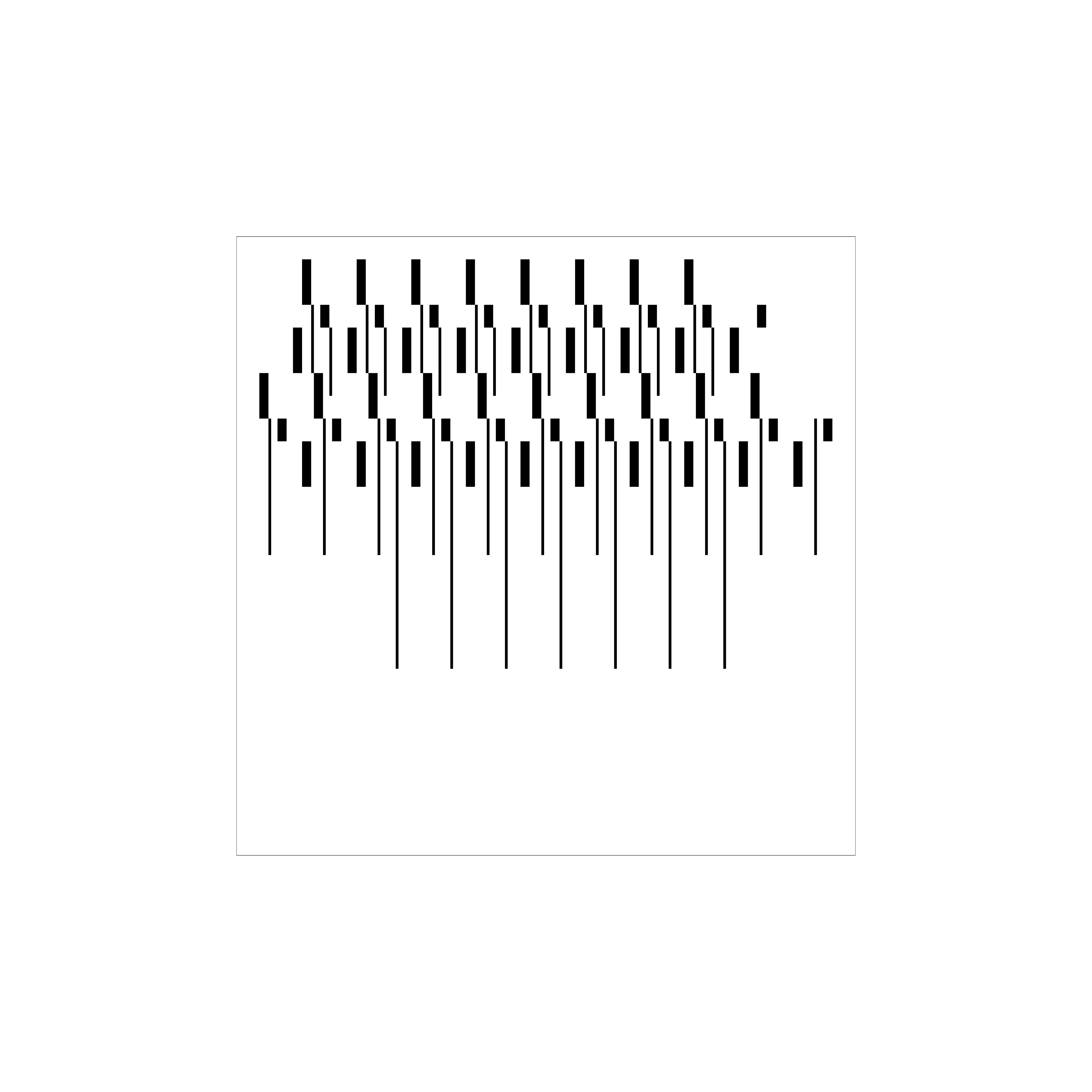
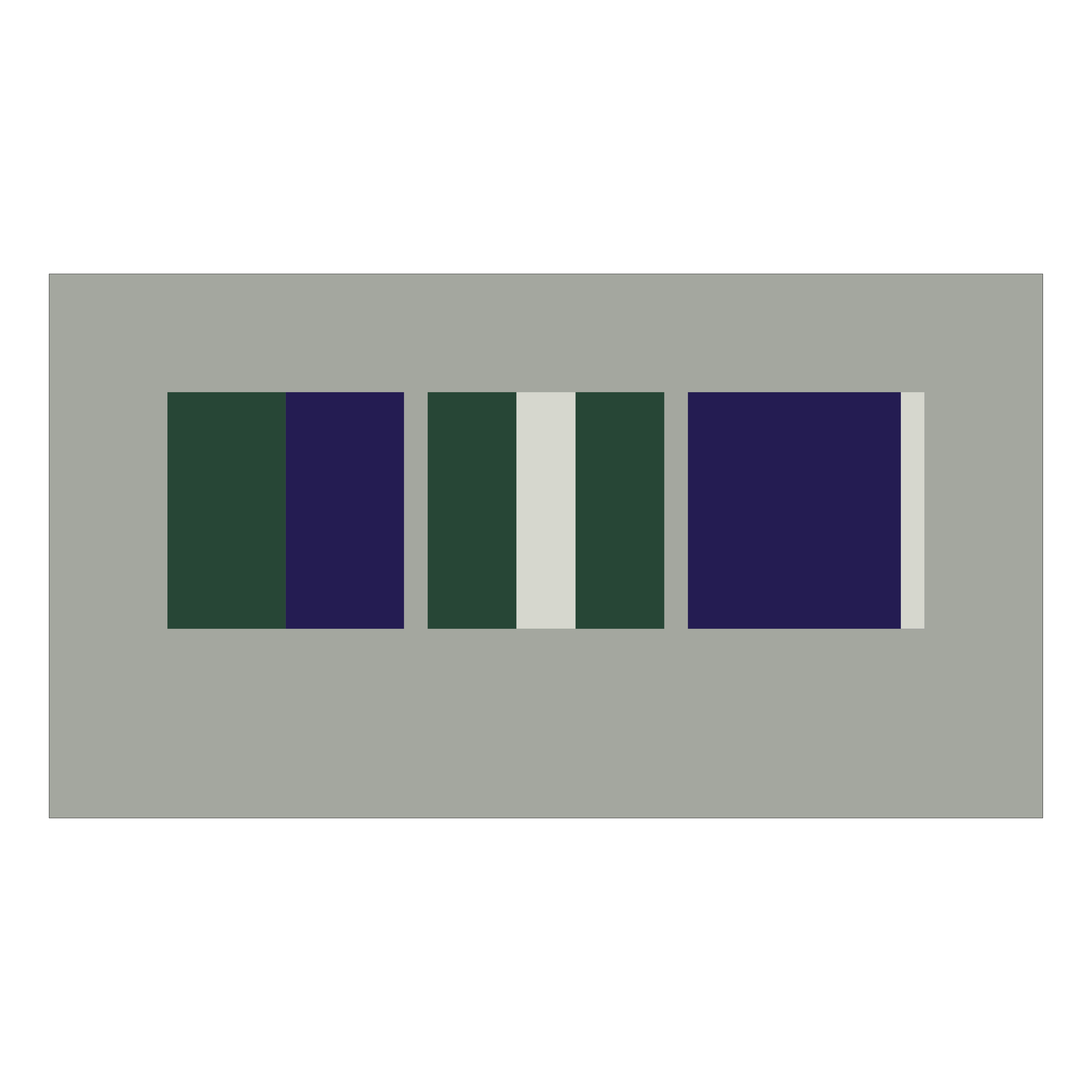
At the centre stands the study of composition as an ordering principle of the design process. Starting from conceptual terms such as order, hierarchy and rhythm, together with the adjective colour chord, abstract arrangements emerge that make the relationships between form, colour, proportion and position visible.
Using reduced, clearly defined elements, precise orthogonal compositions are developed. Across several formats, colour relationships, contrasts and spatial effects are deployed deliberately to create a coherent, systematic overall design.
03
Typography
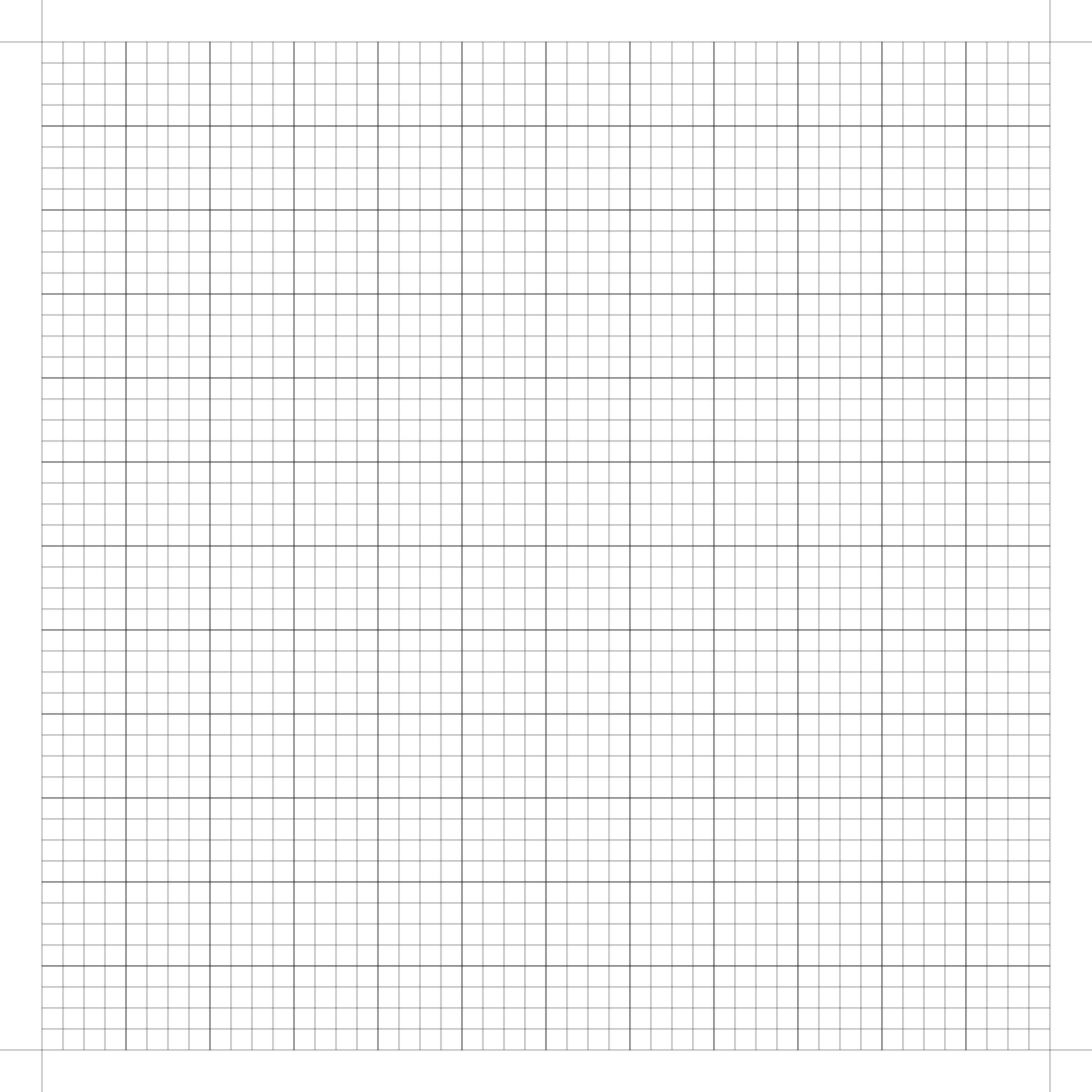
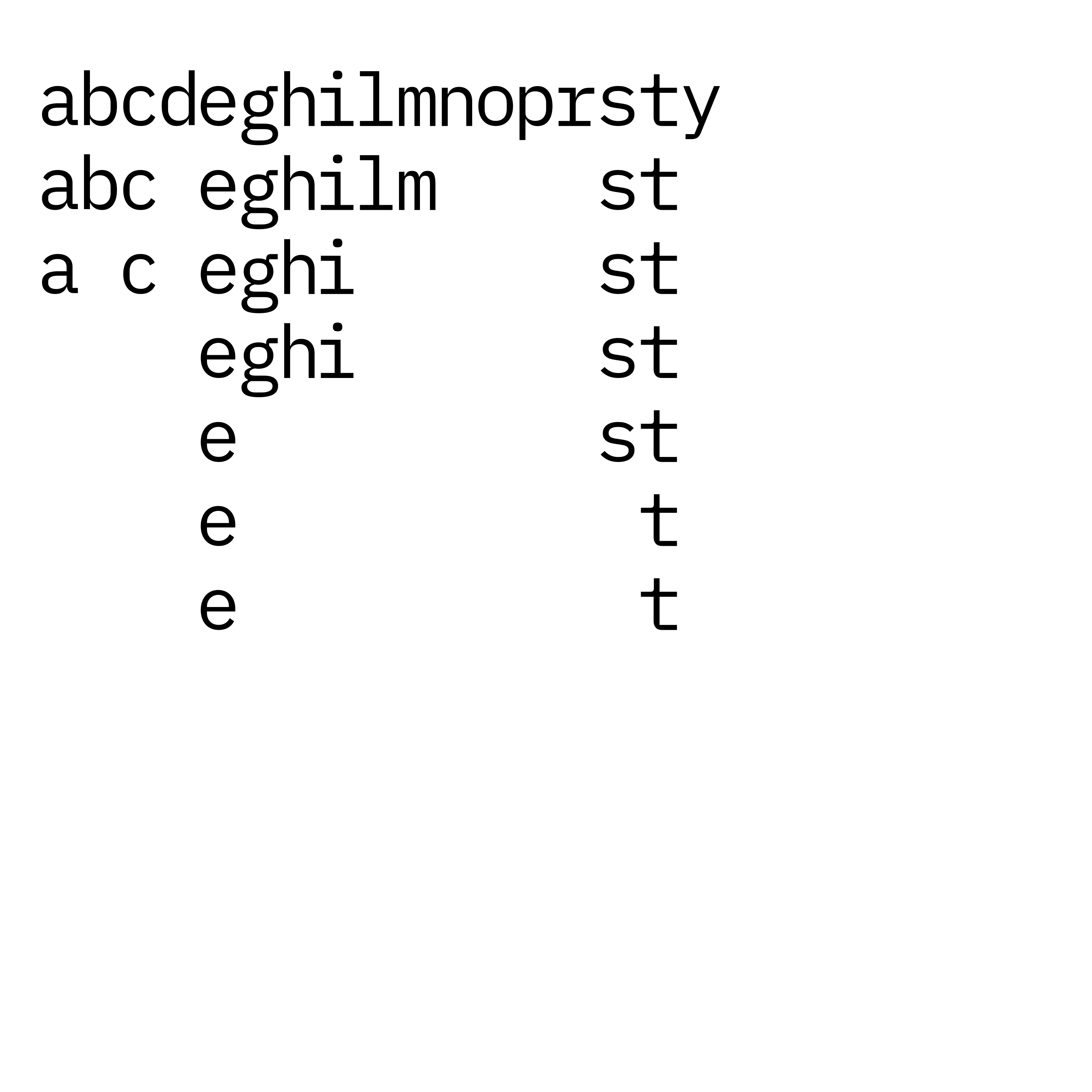
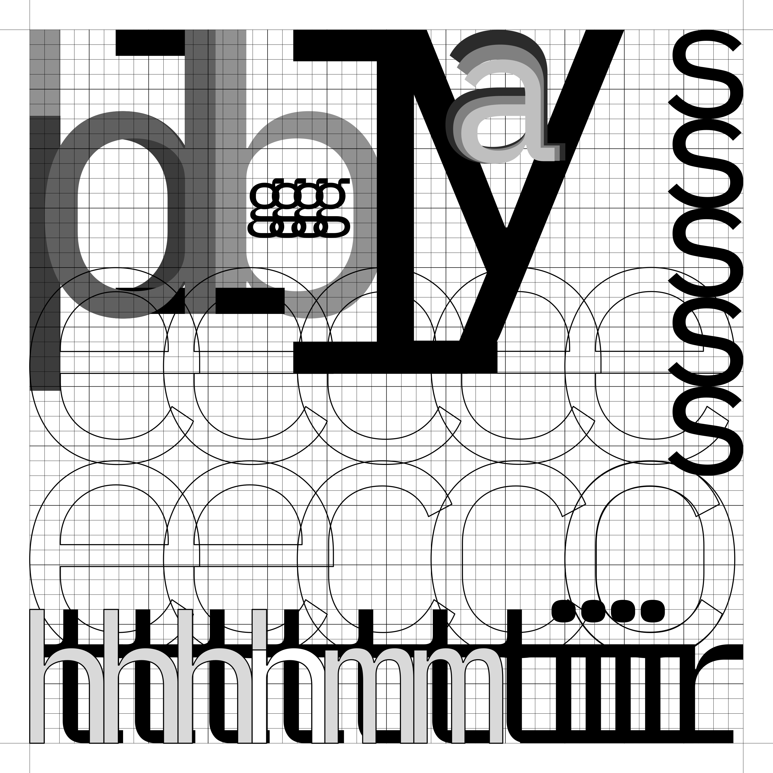
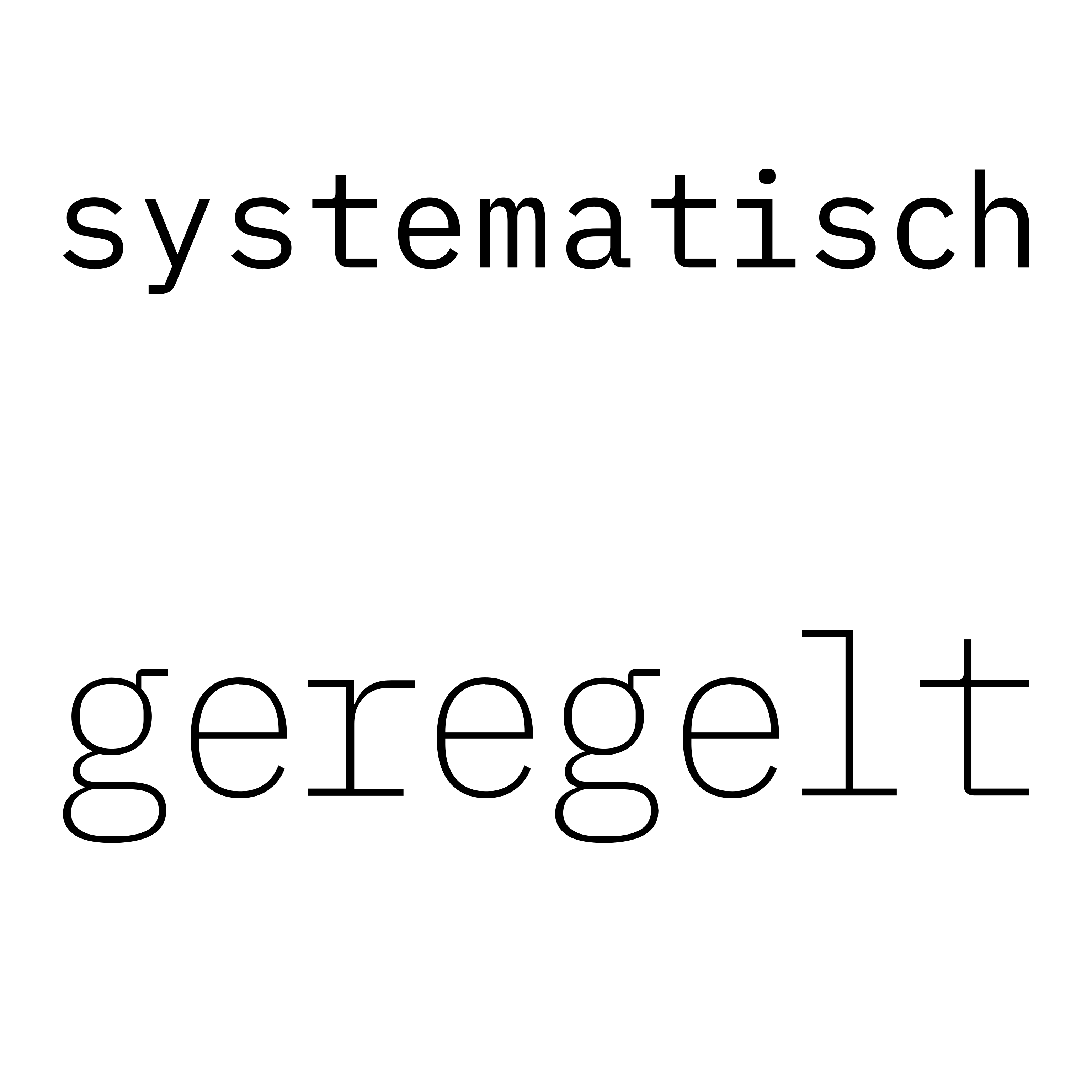
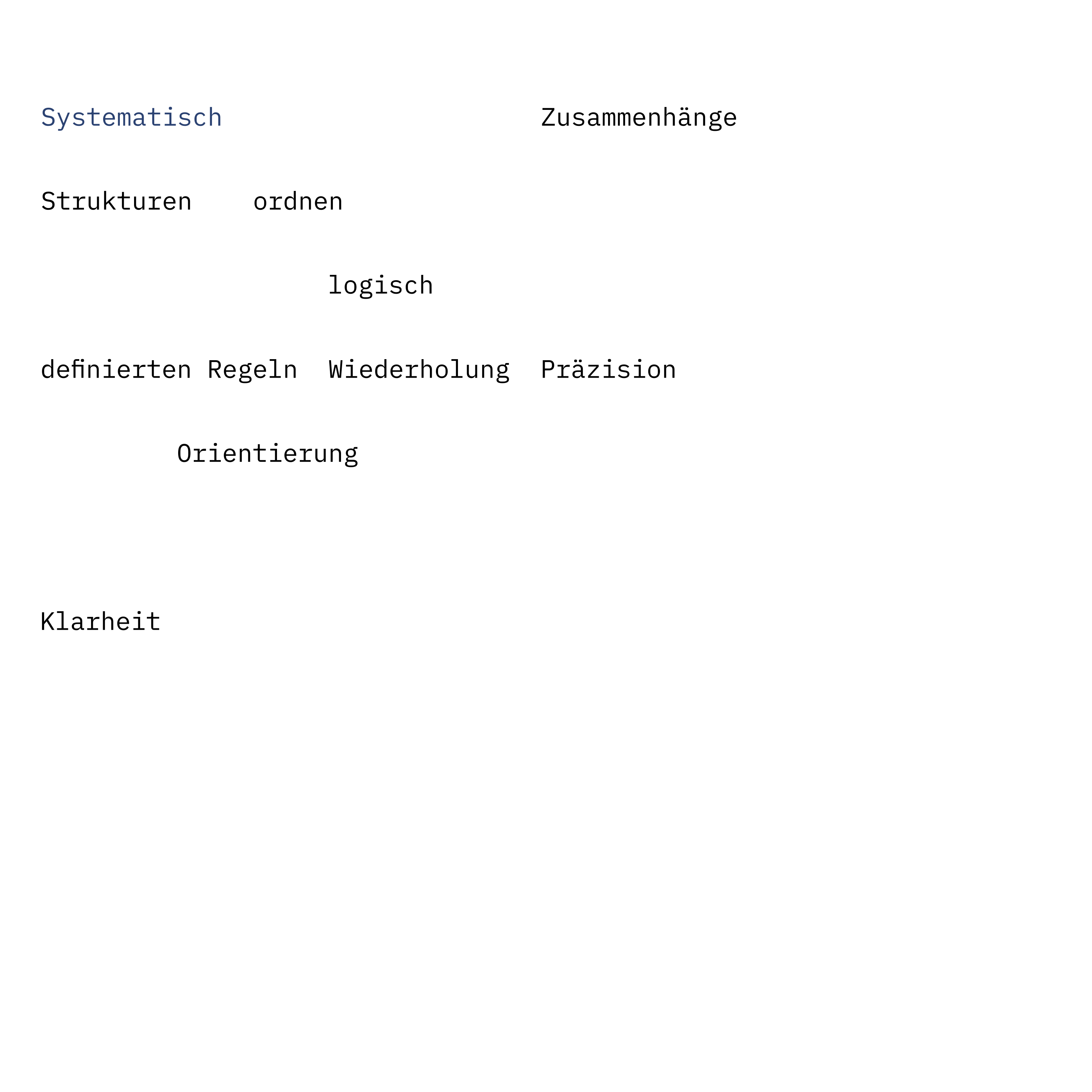
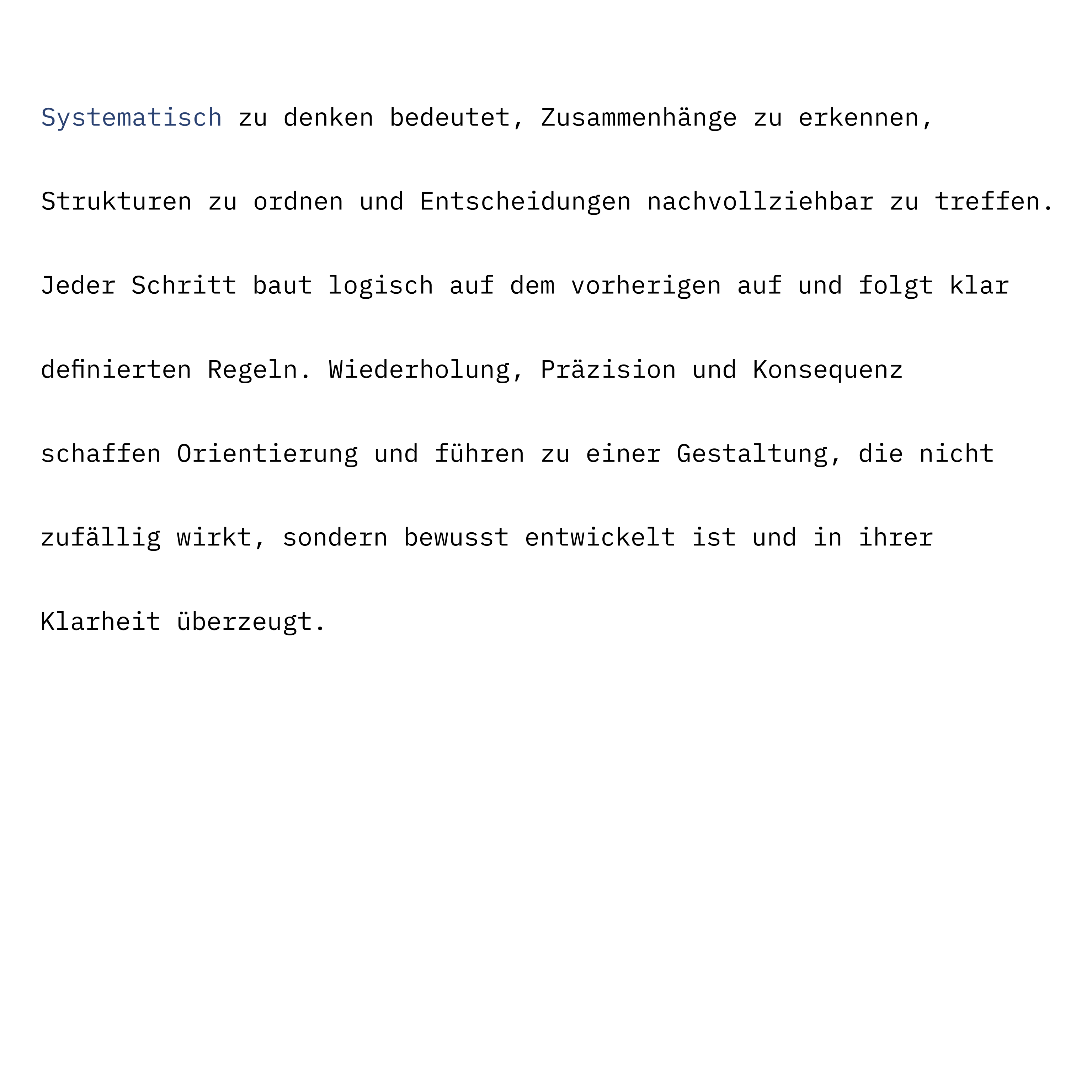
The typographic work examines the systematic use of type in the field of tension between order, structure and legibility. Starting from a self-developed grid, letters are first analysed and grouped, then overlaid, and finally brought together into clearly legible text compositions. The focus lies on the precise tuning of type parameters, hierarchy and reading order — with the aim of giving content and design one comprehensible, consistent form.
04
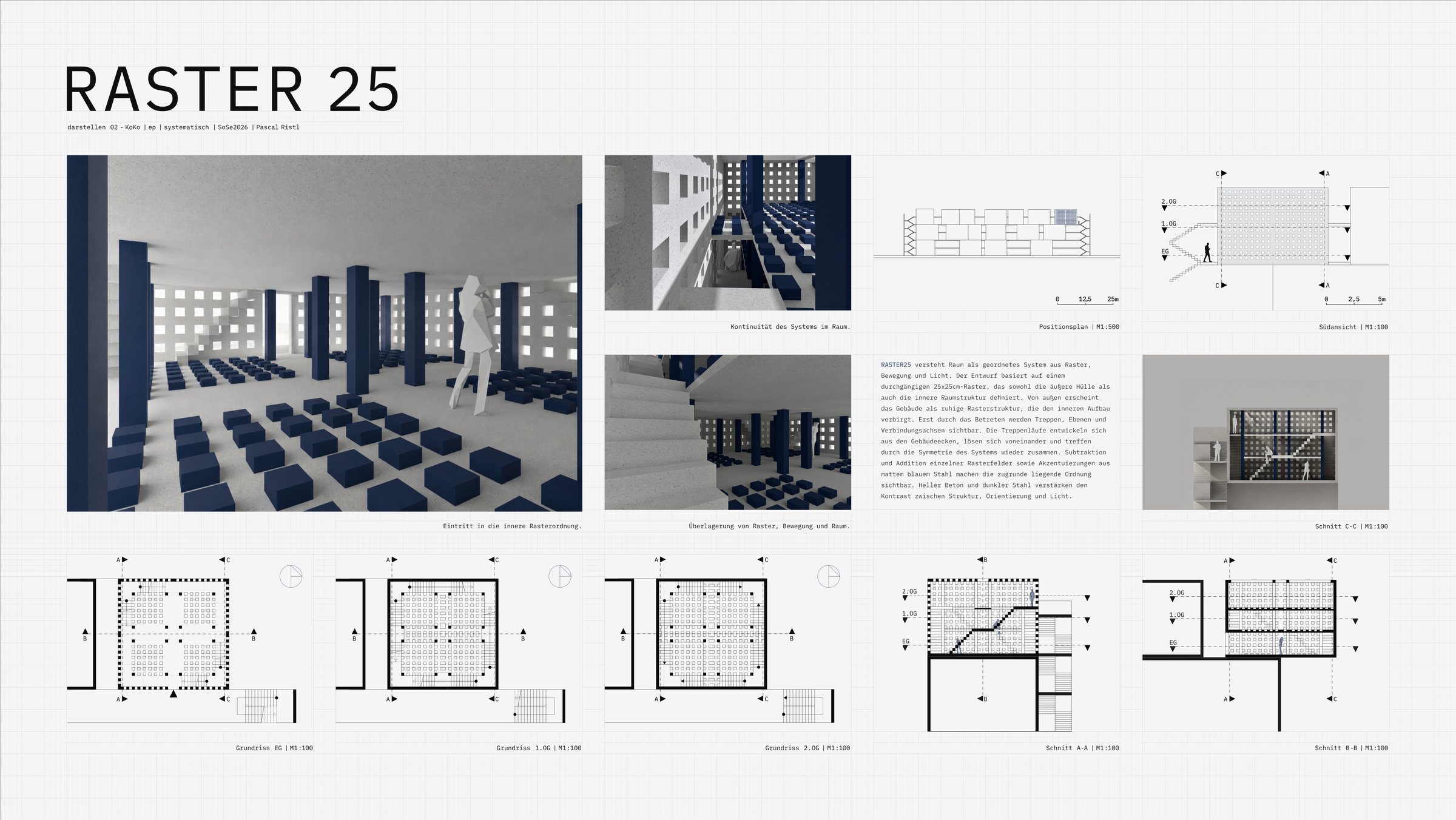
Wordspace RASTER25
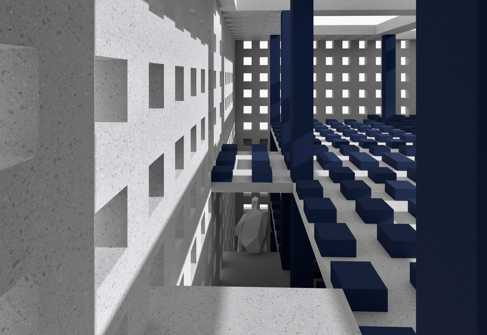
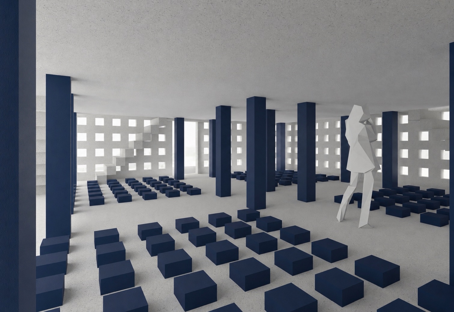
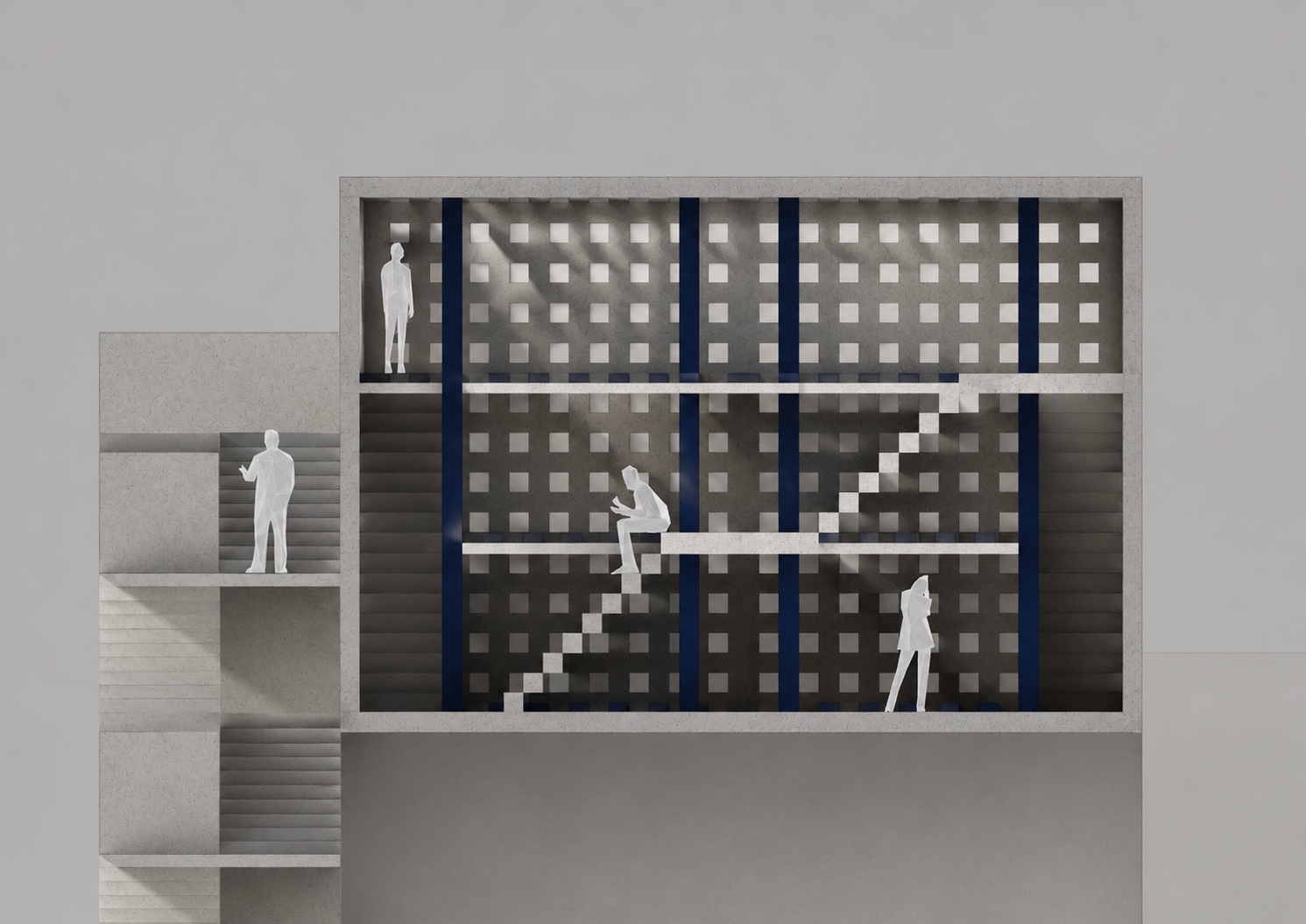
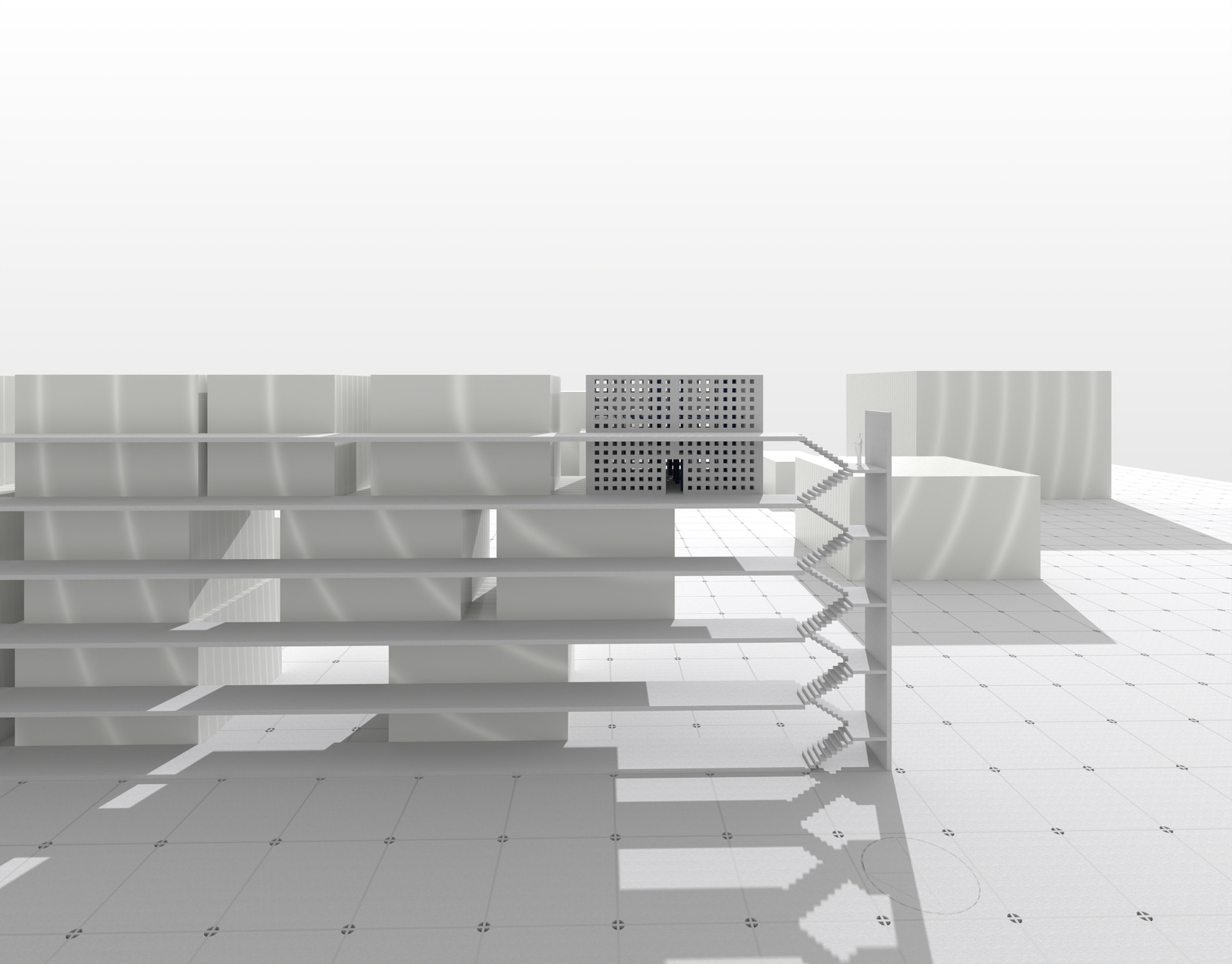
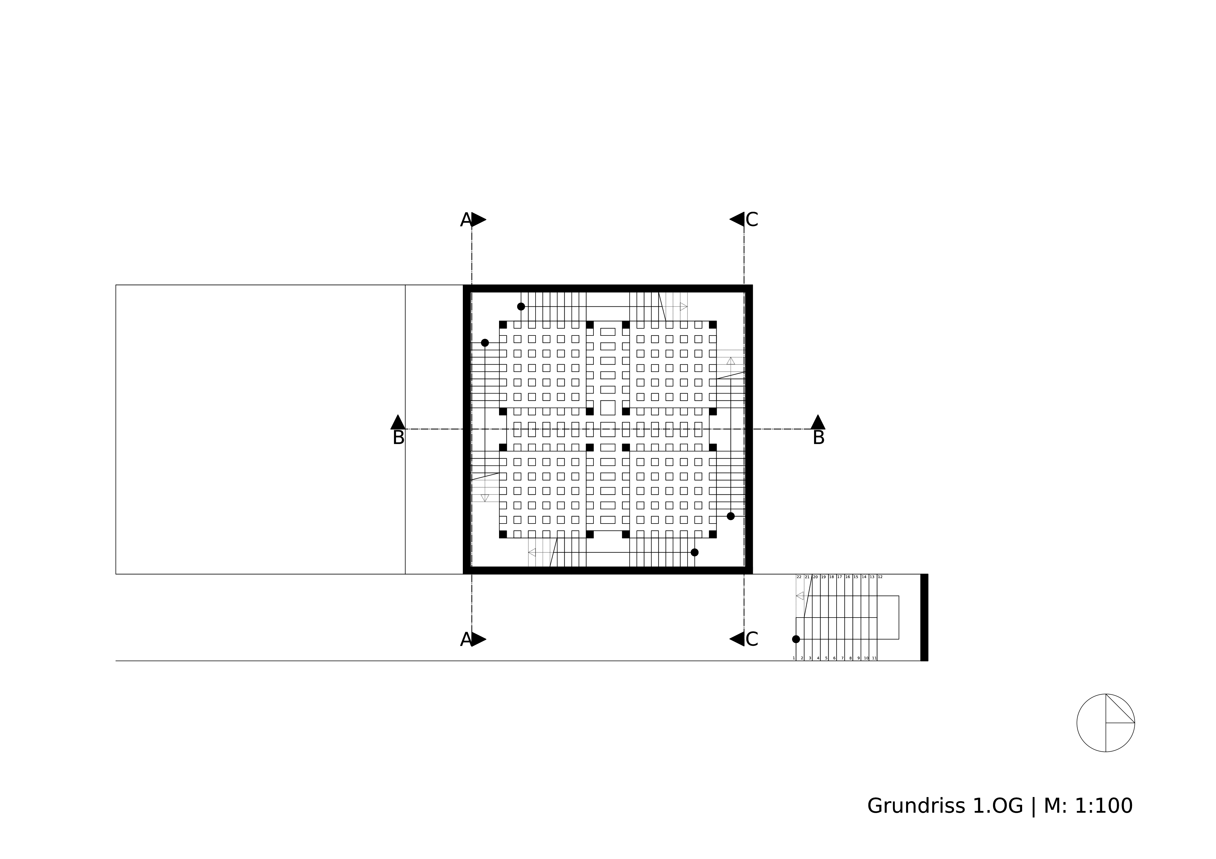
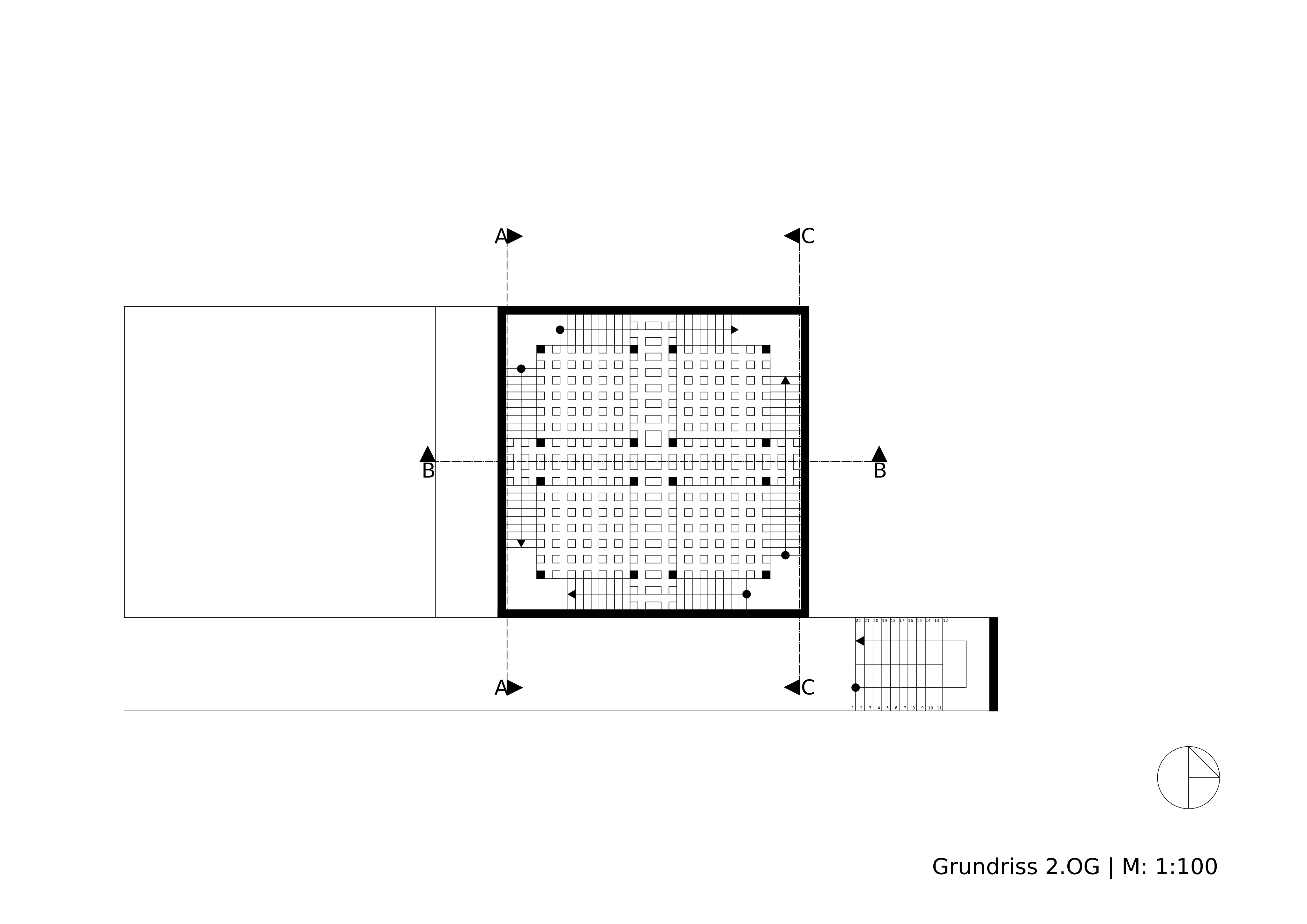
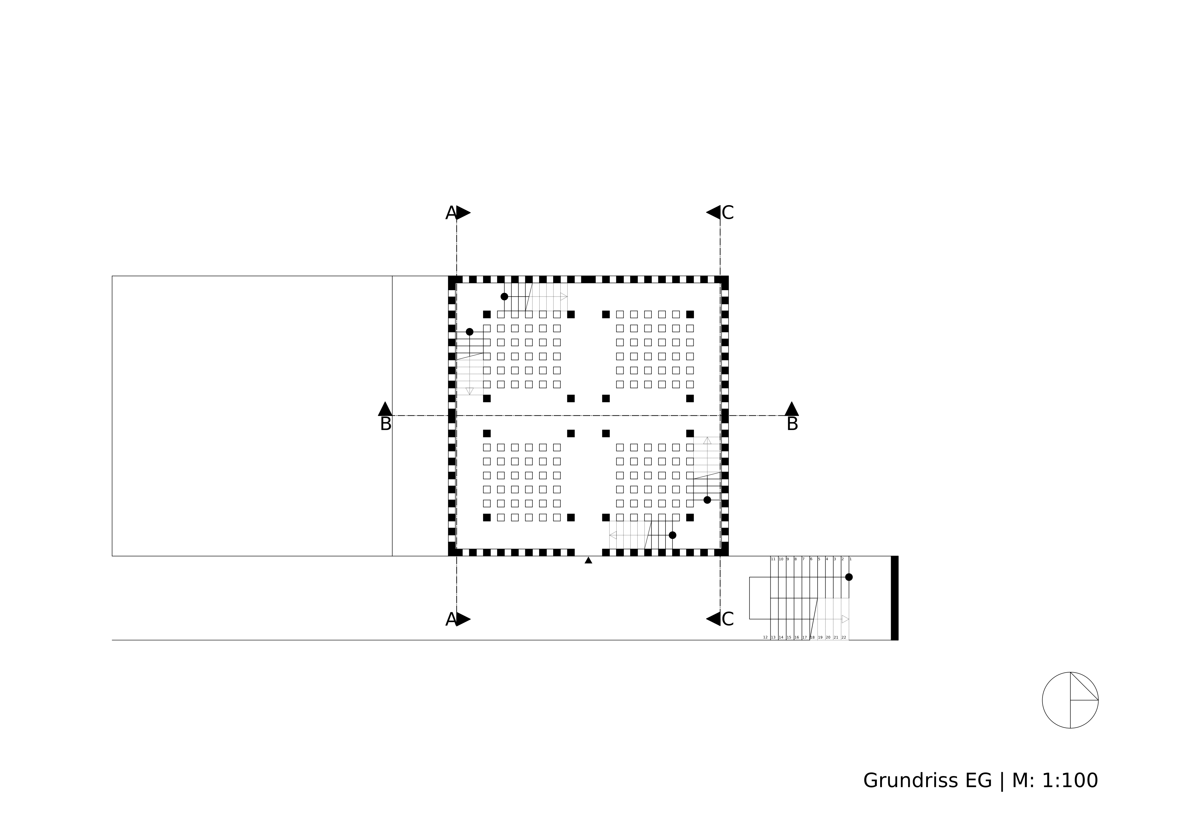
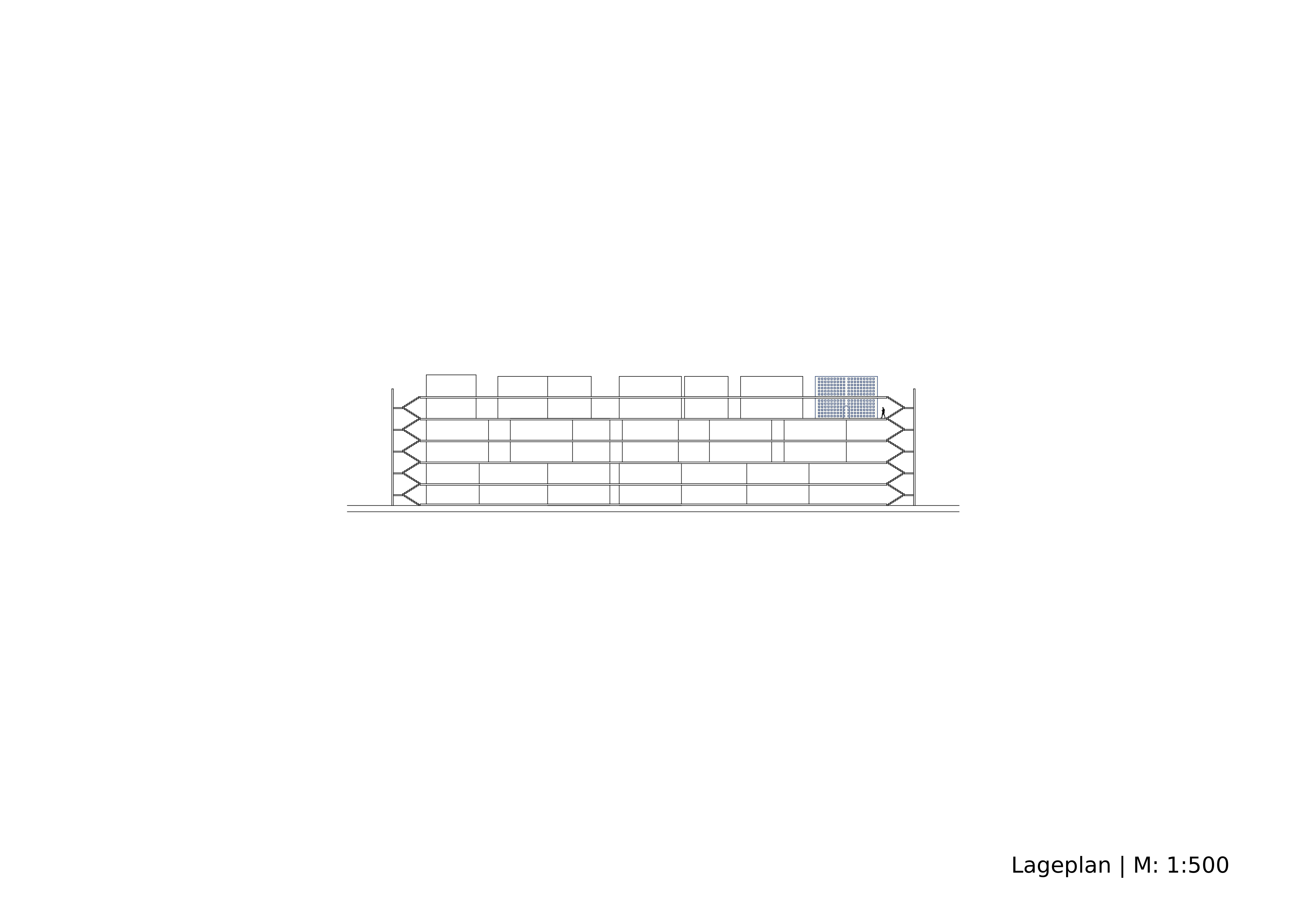
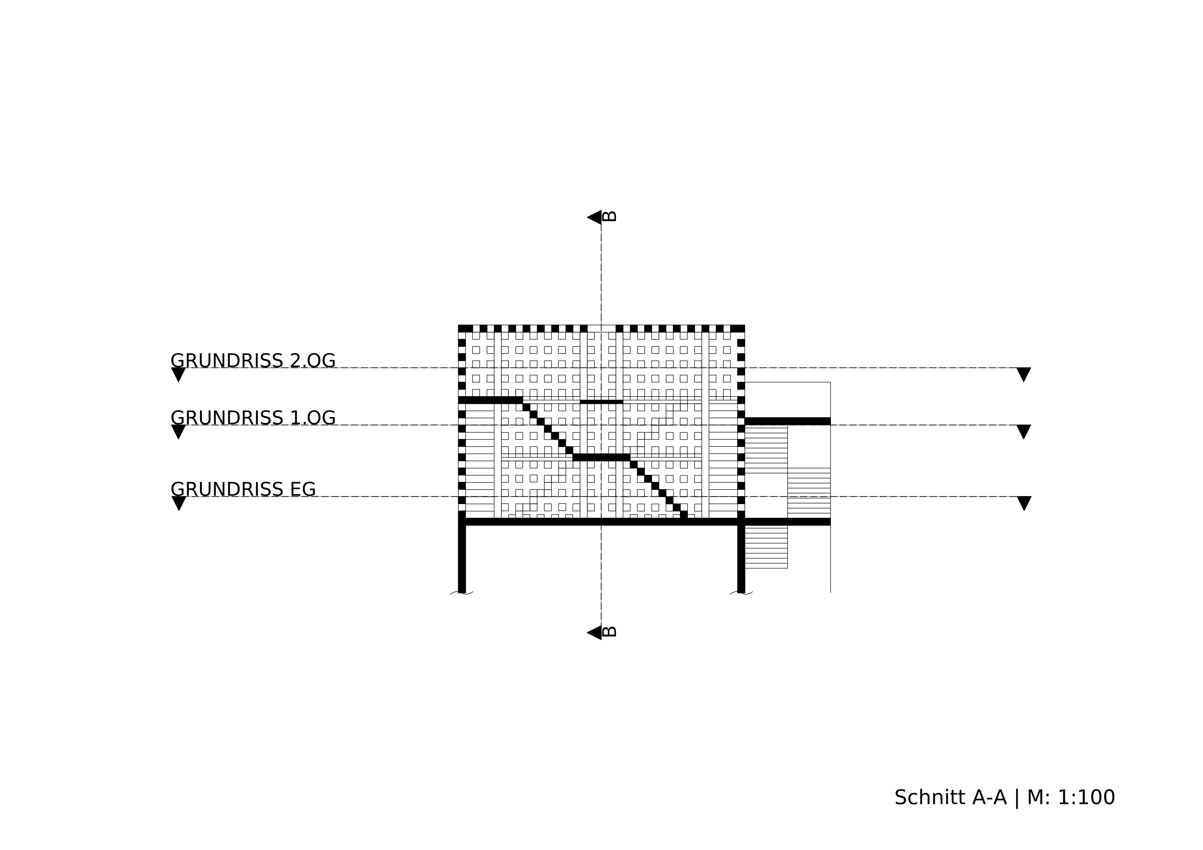
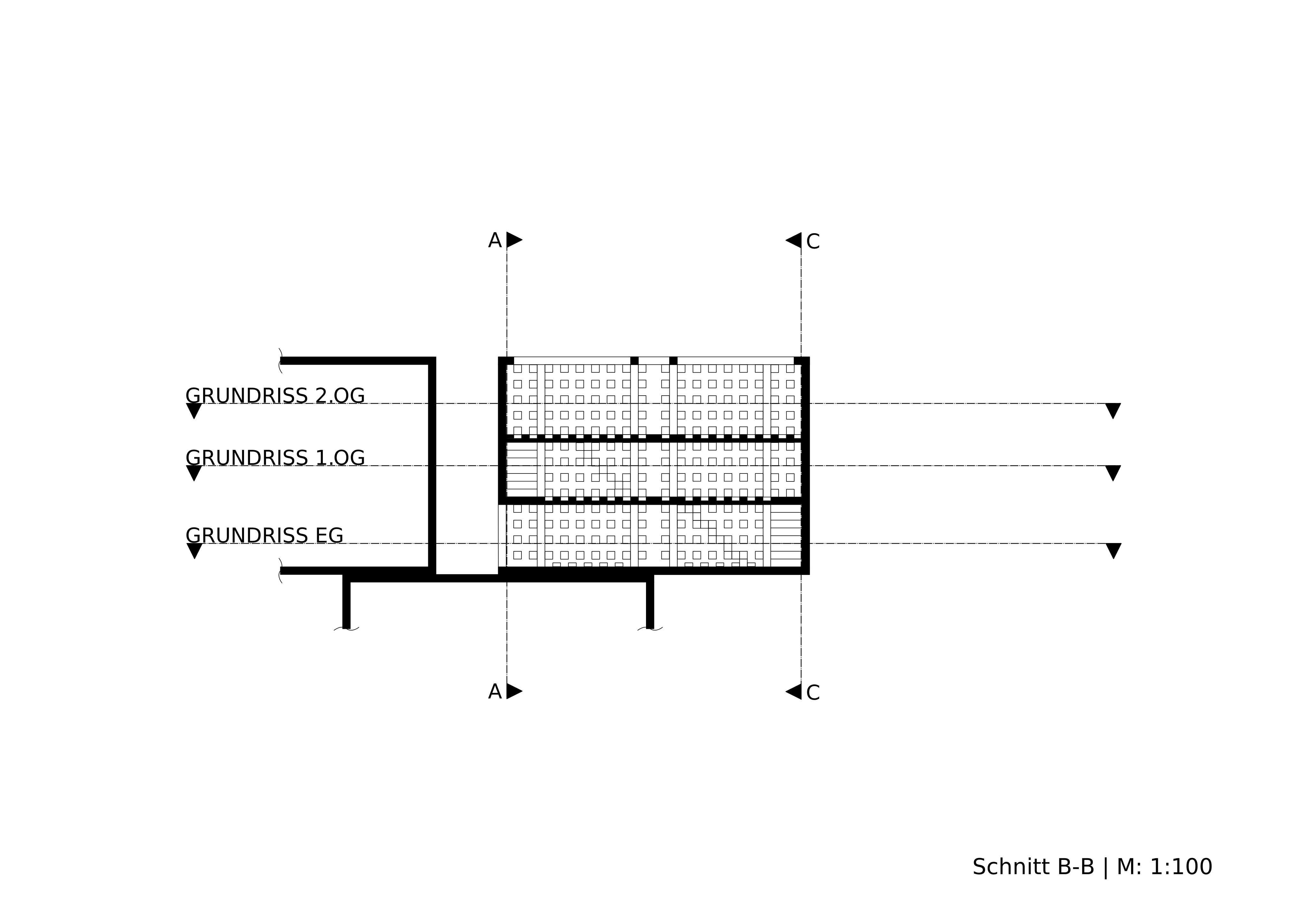
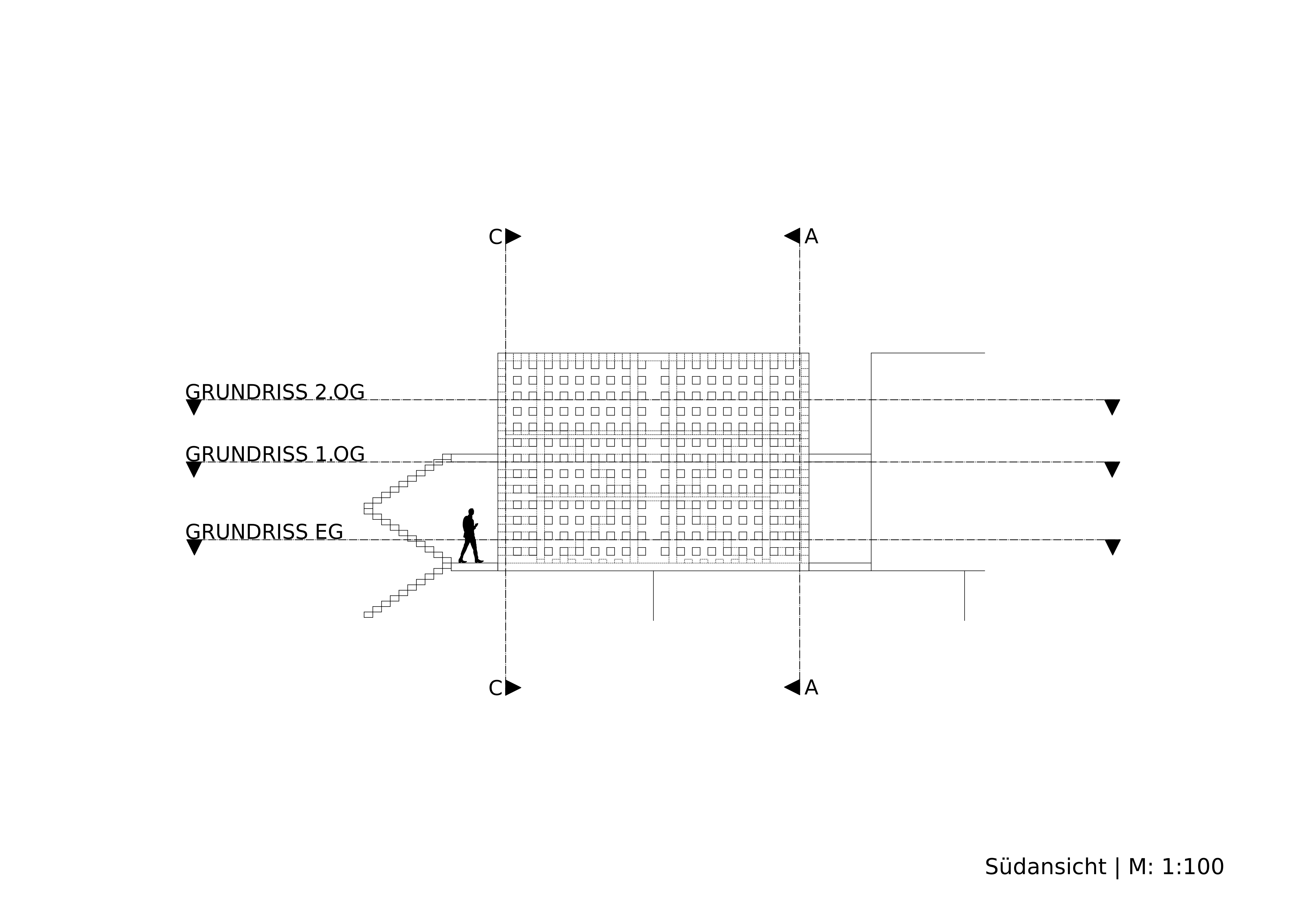
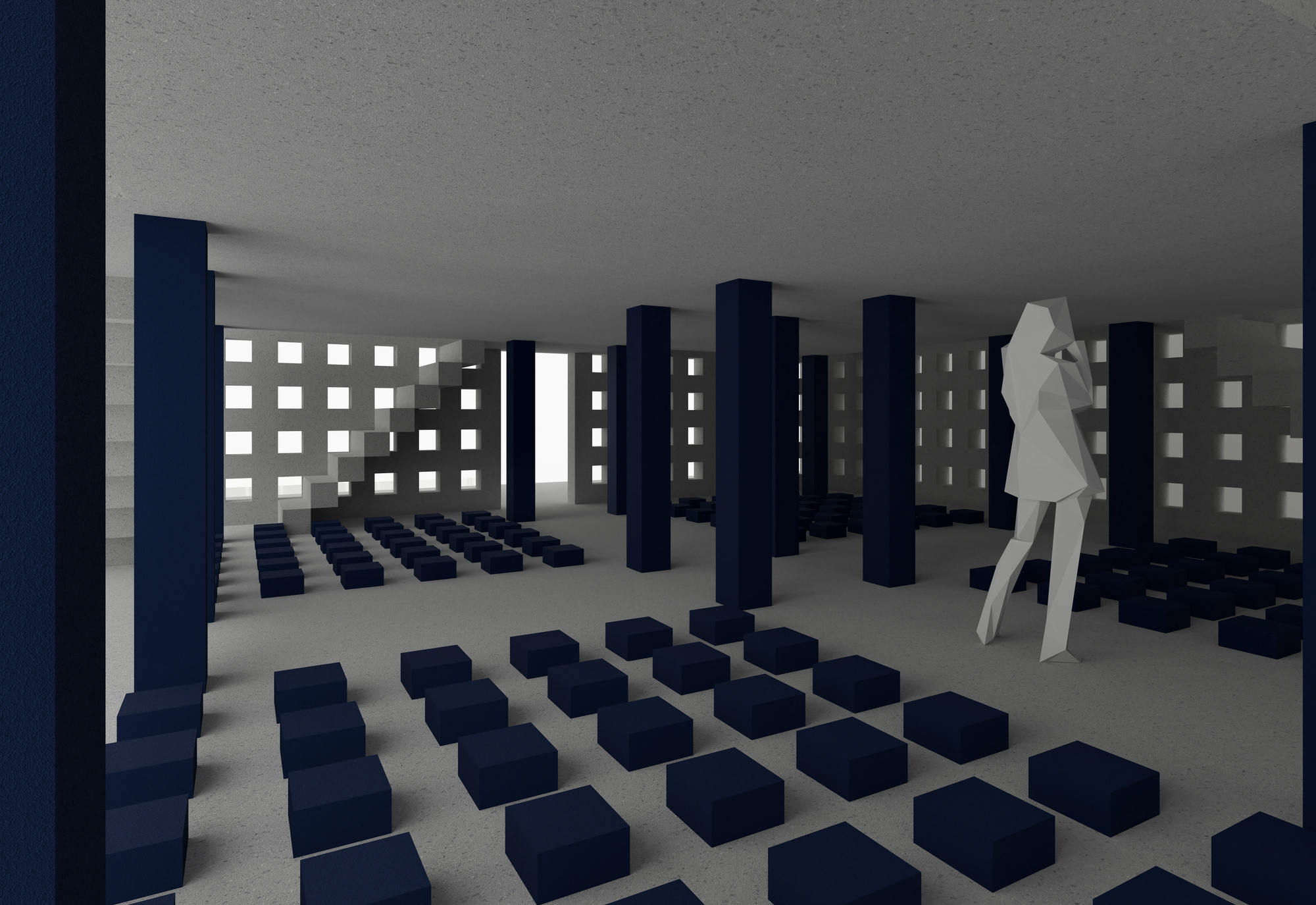
RASTER25 understands space as an ordered system of grid, movement and light, within fixed parameters: 10 m deep, 7 m high, up to 12 m wide, right angles only. A continuous 25 × 25 cm grid defines both the outer shell and the inner spatial structure.
From the outside, the building reads as a calm, consistent grid surface that conceals its inner organisation. Only in passing through do stairs, levels and connecting axes become visible. Subtraction and addition of individual grid cells, together with accents of matte blue steel, make the system legible. Blue serves as the guiding colour for construction and technology.

05
Animation
The animation translates the design into movement and explores frame-by-frame animation as a way of communicating space. The aim was a dramaturgy focused on the design idea: what becomes visible first, how does the space build up, how is the eye guided? The short stop-motion sequence opens up the wordspace layer by layer and makes its spatial depth tangible as a narrative.
06
Poster
The presentation poster brings all representations of the design together into a single one. At its centre stands the engagement with layout as a tool of communication: how arrangement, white space and hierarchy carry a design idea convincingly. It shows the interplay of elevations, sections and visualisations, condensing the skills acquired in colour, composition and typography into a design signature of its own.